• I want to thank all the members that have upgraded your accounts. I truly appreciate your support of the site monetarily. Supporting the site keeps this site up and running as a lot of work daily goes on behind the scenes. Click to Support Signs101 ...

OK....After much work....

Circleville Signs

New Member
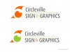
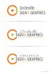
Allright - I posted a thread a couple weeks back working on our new logo. After quite a few iterations (which I will show below), I think i've come up with something that I actually like. It's a bit retro, which i really dig. Let me know if I'm right and this is functional or if I'm out in left field :thankyou:

The first one is our existing logo, then it's my first attempt at a new one, followed by attempt 2, and finally, one that I actually like :)
 

Attachments

  • CSG-Logo-2010_V4.jpg
    CSG-Logo-2010_V4.jpg
    16.2 KB · Views: 110
  • 2012-Logo-V1.png
    2012-Logo-V1.png
    35.8 KB · Views: 132
  • 2012-Logo-V2.png
    2012-Logo-V2.png
    7.4 KB · Views: 121
  • 2012-Logo-V3.png
    2012-Logo-V3.png
    88.8 KB · Views: 136

Gino

Premium Subscriber
It's better, but far too much negative space. It goes beyond tension grabbing.


As of this point, I still like your original the best.
 

Circleville Signs

New Member
OK - taking Gino's thoughts about negative space into account, I moved the "Circleville" up a bit and enlarged "Sign and Graphics". I also canted the image - which I think really spices it up a bit. Thoughts?
 

Attachments

  • 2012-Logo-V3a.png
    2012-Logo-V3a.png
    42.9 KB · Views: 96

Fanaticus

New Member
I like it, it makes me want to smoke a fat joint and listen to some records while sitting in a bean bag with my bell bottoms on. Groovy :)

The original looks the most modern though.
 

Circleville Signs

New Member
I really, REALLY hate the original. It feels very "2006" to me. Maybe I need to not mess with it, but I know I'm not gonna be happy till I make a change. I was shooting for a more retro look and feel with this new design...

What is the consensus on the "est. 2008"? Leave it? Kill it?
 

Gino

Premium Subscriber
Sometimes, you have to let go of something. I think it's time to let go of this notion, you need to change your image. Your original is far more professional and eye-catching then any of your other attempts. It's only 5 years old... you must've liked it at sometime, unless something has happened to turn you against a perfectly fine brand.

I believe you're trying too hard and are grasping at anything.

Let it rest a few days, weeks, months or however long it takes til you come up with something that will work. Trying to force something never works. It will come..... just not by Thanksgiving.... this year.


ps.. drop the 2008. Wait a decade or so before using that stunt
 
Last edited:

wildside

New Member
i like your original better then the new attempts also

we struggled hard with a new brand for us, for a very long time kept trying and trying to come up with something and would just settle on "good enough", until a opportunity came up and proved was the best thing for us

i feel i can design for anybody, anything they want, but when it comes to my own stuff i try way to hard to be impressive that it can turn ugly quick
 
J

john1

Guest
Seriously consider talking to Neato about a logo design. He does top notch work and is very reasonable (seriously he is)

I understand not wanting to pay someone because you figure you can do it but by now you would have had a sweet looking logo and could be making your new cards, t-shirts and vehicle advertising using it.

Just giving advice from my own experience with the same thing a few years ago.
 

Marlene

New Member
I also canted the image - which I think really spices it up a bit. Thoughts?

it is too complex with all those lines and setting it at an angle makes it hard on the eyes.

go back to the thread where you originally started posting your ideas. there were a couple of good ones posted by members that took the logo in a direction that included a circle but weren't so literal. if you stick to the idea you have, the first post's (not the canted) might be re-worked. maybe re-do the swirly lines so there aren't so many so close together and maybe have them not all stop at the same place but stagger the lenghts. how are you going to use the logo? problem with round is it takes up some space so the lettering will always be smaller than the circle image. people will see a dot first and then who you are.
 

Ken

New Member
Yeah, I'm thinking the Est 2008 is either not in the right place or should be dropped altogether.
If the small parallel lines converged on one end it may give a better feel of motion?
Cheers!
Ken
btw..I'm liking #2, but the Circleville font is difficult.
 

iSign

New Member
seriously consider talking to neato about a logo design. He does top notch work...

+1

just giving advice from my own experience with the same thing a few years ago.


+1 (except Dan A in my case... and he let me heavily influence the outcome... harder on him... but the only way I could halfway let go... & I've been extremely happy with the outcome and never regret paying more than I've ever charged)
 

grafixemporium

New Member
Good input in your second post Colin.

Circle, all due respect... you need to consider wiping the slate clean and get some creative input from the generous, creative designers here. None of yours are really knocking it out of the park. Don't feel bad though. It is REALLY REALLY hard to design for yourself.
 
Top