-
I want to thank all the members that have upgraded your accounts. I truly appreciate your support of the site monetarily. Supporting the site keeps this site up and running as a lot of work daily goes on behind the scenes. Click to Support Signs101 ...
You are using an out of date browser. It may not display this or other websites correctly.
You should upgrade or use an alternative browser.
You should upgrade or use an alternative browser.
starting out
- Thread starter Johnny Best
- Start date
- Status
- Not open for further replies.

Imakesigns
New Member
Johnny Best
Active Member
could be a little misleading calling it a sign company if you intend to do stickers and shirts
I will be a sign company and intend to use the stickers on the back of the signs or in the corner that will be produced and the tshirts will be for myself and helpers when working on job sites. Sorry you were mislead.
Johnny Best
Active Member


Johnny Best
Active Member
Wish I was related...You could go with something a little more noticeable...................

WhiskeyDreamer
Professional Snow Ninja
Thanks for the suggestions guys. Got rid of the diamond and the dot and just made it Best Signs.
Having the "good better" in the background is distracting. Why not just keep it simple with straight text and get rid of the extra stuff? If you're planning to put this on decals and shirts, you want something clean, easy to read and easily reproduced at a small size.
The Vector Doctor
Chief Bezier Manipulator
Agree with Fenris... this is a step backwards
Johnny Best
Active Member


Rick
Certified Enneadecagon Designer
Worked with a friend of mine who is a designer and came up with this. The star one was my last try and then asked for help.
Is his last name designer?
I don't understand how you (or the designer) can't see it.
The star shape is awkward, the tracking on the second one makes it nearly illegible...
You might want to look at any logo lounge book or join logolounge.com for 100 bucks and look for inspiration.
Learn the process...
https://vimeo.com/113751583
SignManiac
New Member
Your optical orb is lacking the ability to perceive the subtle distinctions that relate to the visual and graphic compositional elements that make up a good design.
Johnny Best
Active Member
Is his last name designer?
I don't understand how you (or the designer) can't see it.
The star shape is awkward, the tracking on the second one makes it nearly illegible...
You might want to look at any logo lounge book or join logolounge.com for 100 bucks and look for inspiration.
Learn the process...
https://vimeo.com/113751583
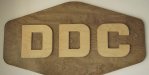
So I went to that vimeo and saw this logo he did, so this is what I should do. Just put BEST is caps and put it on a piece of wood. Thanks for that information bro.
"you can't see that said the blind man to the deaf man as the lame man led them off".
Attachments
Rick
Certified Enneadecagon Designer
So I went to that vimeo and saw this logo he did, so this is what I should do. Just put BEST is caps and put it on a piece of wood. Thanks for that information bro.
"you can't see that said the blind man to the deaf man as the lame man led them off".
So that's what you got out of that?
"You can lead a horse to water..."
Johnny Best
Active Member
So that's what you got out of that?
"You can lead a horse to water..."
As Frank Gorshin use to say, "if you can lead a horse to water and make him float on his back you've got something".
I thought the logo turned out nice that was completed, you come on and tell me that I don't see something. That is like telling someone their girlfriend is not good looking and I should see that.
And to use another old quote that you seem to like to do. You know what opinions are like...
I am new here and not looking for trouble and would like advice to help. Not having me look at videos or join some club for $100 and report back to you.
Is his last name designer?
I don't understand how you (or the designer) can't see it.
The star shape is awkward, the tracking on the second one makes it nearly illegible...
You might want to look at any logo lounge book or join logolounge.com for 100 bucks and look for inspiration.
Learn the process...
https://vimeo.com/113751583
Thank you for posting this. I'm always trying to advance my thought process while taking on a design challenge. Comforting to know I already follow some of the same fundamentals as he does while brainstorming.
Thanks!
Rick
Certified Enneadecagon Designer
As Frank Gorshin use to say, "if you can lead a horse to water and make him float on his back you've got something".
I thought the logo turned out nice that was completed, you come on and tell me that I don't see something. That is like telling someone their girlfriend is not good looking and I should see that.
And to use another old quote that you seem to like to do. You know what opinions are like...
I am new here and not looking for trouble and would like advice to help. Not having me look at videos or join some club for $100 and report back to you.
ummmm, if your logo was your girlfriend, she needs some work....
No need to report back, you did that all on your own...
I actually watched the video... a few times. It's about the process of design.
I happen to like Draplin's his work, and his attitude...
As far at the 100 bucks, I own all the books and am in the club... even have a few on there,
that's some 1000+ investment on my part because I see the value in it... then again, I get
paid quite a bit to design logos... way more than all the books and the site costs for one logo...
another tool in my arsenal I can use to better my skills and service my clients.
Imagine, a seasoned designer taking the time to show someone how to do something or where
to get the imformation.
You are typical of the "Attention all Newbies" thread.
http://www.signs101.com/forums/showthread.php?58046-Attention-all-newbies
Get some thicker skin, you're gonna need it.
SignManiac
New Member
Thank you Rick. I wanted to post that same link but was to lazy to put forth the effort required ") I've kind of given up trying to help those in need. I admire your perseverance and dedication to help those that are graphically challenged. You are a valuable asset to the design community...
I've kind of given up trying to help those in need. I admire your perseverance and dedication to help those that are graphically challenged. You are a valuable asset to the design community...
I've kind of given up trying to help those in need. I admire your perseverance and dedication to help those that are graphically challenged. You are a valuable asset to the design community...Johnny Best
Active Member
SignManiac
New Member
I've seen a lot of Ricks work, and he makes me look like a beginner. He knows more about design fundamentals than I can hope to learn in the rest of my lifetime. You have no idea how silly you are making yourself look here among the many who know and respect Ricks wisdom and talent.
You will cut off your nose to spite your face dude. A wise man will listen carefully when advise is given freely to help those who need it...
You will cut off your nose to spite your face dude. A wise man will listen carefully when advise is given freely to help those who need it...
- Status
- Not open for further replies.