-
I want to thank all the members that have upgraded your accounts. I truly appreciate your support of the site monetarily. Supporting the site keeps this site up and running as a lot of work daily goes on behind the scenes. Click to Support Signs101 ...
You are using an out of date browser. It may not display this or other websites correctly.
You should upgrade or use an alternative browser.
You should upgrade or use an alternative browser.
What do you think?
- Thread starter langecustomgraphics
- Start date

GypsyGraphics
New Member
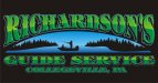
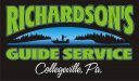
is the a logo or a sign?
it looks a bit elongated to me, unless it's done to fit a particular size.
a couple of thoughts... the two tone in Richardson's is too harsh a divide. i think a soft gradient would look nicer. and maybe make the blend follow the same arch as the graphic below. although it won't be as obvious once it's a soft gradient.
the font choice is okay, but i'd keep that stylized font just for the name... it's too much on all three lines and difficult to read in the smaller size.
langecustomgraphics
New Member
Cool. I will tweak it.
10sacer
New Member
Kinda reminds me of Fredo getting whacked in The Godfather II.
I would take the earlier suggestion and turn them facing opposite. Also gives the impression of multiple guys catching fish because the way it is now - the dude on the left has his pole in the boat pointing at the other guy's crotch.
Might also want to bend one or both poles so it looks like they are catching fish and not just fishing.
SignManiac
New Member
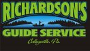
Contrast issues are the primary problem
Jillbeans
New Member
I really dislike your font choice.
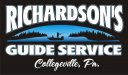
One version is smashed one stretched.
Using the same font doesn't designate which item is most important.
I like the sunset pictorial but if the text was white and less ornate.
Something distortion-friendly like Big Red or Antique Olive Nord.
The name should be in a nice script and use the old-fashioned "Pa." abbreviation.
Not that I like abbreviations but Collegeville is a long name.
If you must use a blend in the letters go from white to light grey or white to a soft yellow or peach.
But don't put a blend in everything.
Love....Jill
langecustomgraphics
New Member
John Butto
New Member
real fishing experience
my take with my own pic...
my take with my own pic...
Jillbeans
New Member
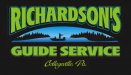
Better...but try a white to green gradient.
Or even plain white.
It's very dark still.
I wouldn't make it have a drop shadow but on both the name and the service I'd do a black outline with a very thin process blue pinline outline.
It's at least a million times easier to read now.
")
Or even plain white.
It's very dark still.
I wouldn't make it have a drop shadow but on both the name and the service I'd do a black outline with a very thin process blue pinline outline.
It's at least a million times easier to read now.
langecustomgraphics
New Member

TheSellOut
New Member
I made the attached image to help explain some of my suggestions.
I think you should make two gradients, one for the sky and one for the lake to define the horizon. Also you could add a reflection in the water for the trees. and where the tree line meets the water could use a little attention to look more clean and fluid.
Just out of curiousity...is that the type of boat the guy has? if so then no problem, but if not...it does makes him look cheap.
Attachments

GypsyGraphics
New Member
love Heath's example... the way the gradients define the space.