-
I want to thank all the members that have upgraded your accounts. I truly appreciate your support of the site monetarily. Supporting the site keeps this site up and running as a lot of work daily goes on behind the scenes. Click to Support Signs101 ...
You are using an out of date browser. It may not display this or other websites correctly.
You should upgrade or use an alternative browser.
You should upgrade or use an alternative browser.
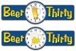
Houseboat sign critique
- Thread starter J Hill Designs
- Start date

Jim Doggett
New Member
Beer :45? But other than that, I like!
Jim
Jim
J Hill Designs
New Member

ActualGrafix
New Member
I think you should make it look like a wrist watch with a cartoon mug in the middle
Jillbeans
New Member
My ex hubby had a clock on which every hour was 5:00.
It mysteriously dissapeared.
")
Just like he did.
OK I think the background stripes are detracting from it, along with the gradient in the font. I would try a thicker style like A&S Jiggy Roman, and also the wristwatch idea is cute. Either that or simply change the lettering you now have to white with a heavier black outline and a transparent looking drop shadow.
Love....Jill
It mysteriously dissapeared.
Just like he did.
OK I think the background stripes are detracting from it, along with the gradient in the font. I would try a thicker style like A&S Jiggy Roman, and also the wristwatch idea is cute. Either that or simply change the lettering you now have to white with a heavier black outline and a transparent looking drop shadow.
Love....Jill
signgal
New Member
i would try a cartoon beer ... cartoony font needs a cartoony beer in my humble opinion!
+1
Craig Sjoquist
New Member
I like the start ... oh yea you can do all sorts of cool stuff with that start indeed.
The name by it self gets ya thinking
1 thing I do is put dimension on the clock and letters and panel yup since ya got all the suggestions try them too if your not in a hurry will be a great looking boat name etc.
likes the stripes but not so much contrast they should look like a pinstripe suit would
The Big Squeegee
Long Time Member
I'd get rid of the hour hand and froth up the lettering. The gradient on the lettering could be about the same as the beer.

J Hill Designs
New Member
Thanks guys! I'll play with the suggestions over the next couple days... :signs101::U Rock:
:signs101::U Rock:jfiscus
Rap Master
There is a local restaurant/bar called BEER:30, the sign is made to look like a large LCD alarm clock & works well, makes everyone laugh. Might be a good option to try. http://www.myspace.com/cardisbarandgrill
J Hill Designs
New Member
yeah saw that in a google image search while getting ideas...I wanted something a little less digital - thanks tho! 
J Hill Designs
New Member
I think some subtle bubbles would be a nice touch in the font.
Here's my latest revisions (I'll let him decide on cartoon beer vs. real beer) - I might do the bubble in the font thing - great idea blue
oh yeah, found out houseboat is blue/white so I changed up the color scheme a bit