-
I want to thank all the members that have upgraded your accounts. I truly appreciate your support of the site monetarily. Supporting the site keeps this site up and running as a lot of work daily goes on behind the scenes. Click to Support Signs101 ...
You are using an out of date browser. It may not display this or other websites correctly.
You should upgrade or use an alternative browser.
You should upgrade or use an alternative browser.
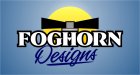
Logo and intro
- Thread starter Foghorn12
- Start date
Craig Sjoquist
New Member
I like your design, ..great start some playing around with it it will be perfect
contrast is poor ... do you have a color wheel ..look online if not this will help contrast colors or to harmonize
the flow can improve but good
Welcome to a outstanding forum and people
contrast is poor ... do you have a color wheel ..look online if not this will help contrast colors or to harmonize
the flow can improve but good
Welcome to a outstanding forum and people

signmeup
New Member
I think you need a new name.Foghorn is a name that my brother used for his screen printing operation he ran in high school. He catered to local bands. When he graduated we wanted to join forces so we kept the name. Not very creative by any means but it was already established so it works for us. Now that we are expanding into surrounding areas we get a lot of questions about it but we just laugh it off. There is no quick and easy way to explain it so we try not to.
washingtonsignguy
New Member
Your new logo is better than the last. Foghorn is much easier read. I think the design looks alittle crammed together. I would see what it would look like with a lightweight font used on foghorn. I think the two words kinda compete, being the same thickness and all. I am currently working on a new logo for my shop also, It cannot be said enough that your own is the hardest.
Jillbeans
New Member
It's really hard to read.
The light sources seem to be conflicting, and I really dislike the way you used two different "s"s. I prefer the first, (usually the alternate s) in the layout.
I also don't like the missing "e" in Designs.
If you are stuck on using that, maybe straighten out FOGHORN and try angling, not arching, the script.
Love....Jill
PS
Just saw the second one.
I dislike seeing a casual font and a script together.
I'd suggest losing every single effect and playing around with the layout in black and white first before tarting it up.
Marlene
New Member
welcome to the site, now step away from the special effects on your 'puter! your name is confusing at best. the Dsigns is hard to grasp right off and special effecting it to death isn't helping. sorry to be so tough on you but it's just way too over done. since you picked the foghorn can I ask why? what does it mean to you? once you answer that, it might help you get that same meaning into your design. right now, I'm not seeing it mean anything but just another element to special effect to death. when I think foghorn, I think ocean, misty colors, blues, teals, soft, stuff like that. what do you think of?
signgal
New Member
Here's a quick suggestion, not 100% sure what a fog horn looks like, only those cans of compressed air horns for on boats.
Mine kinda looks like a busted helicopter.
Nice example of effective lettering and pulling the "foghorn" into play to keep heads from drifting to the big cartoon rooster. LOL
Also, I have to disagree with the name being confusing and the suggestions to ditch it... if people are asking about it, they are remembering it and wondering about it. What more could you ask for?
Rodi
New Member
You should keep in mind that it should be clean and easy (I.E. cheap) to reproduce. This is a 4 color process print no matter what media you would use it on. What does it look like black and white? Can it be reproduced nicely black and white. What if you want to screen print it? $$$$$
Great point, I always say that to people, especially on BCs, logos etc. Can I swipe this paragraph
")
artsnletters
New Member
My question as well..
That "D" doesn't jive with the rest...i seem to see "signs" predominately and to nit pick the lowercase "i" needs a dot. Is the thing coming off the D supposed to imply a hyphen? Cause it doesn't.
Either way, Welcome and keep posting.
Tim
artsnletters
New Member
I'm changing my name to "Blue Rutabega Signs" then.
i was looking for Marvin the Martian Marketing and Design
TheSellOut
New Member
I like where JBeans is going with this! For one, her lettering is easy to read, it looks great, and the use of some graphic foghorns will speak loud and clear to your customers.
Marlene
New Member
I like where JBeans is going with this! For one, her lettering is easy to read, it looks great, and the use of some graphic foghorns will speak loud and clear to your customers
I liked where she went too but the biggest problem is that it isn't "designs" it's "dsigns" so if you don't do something to show that the intent was to leave out a letter, it will look like the guy couldn't make his own logo without a typo. foghorn is stuck with having to deal with communicating that "dsigns" isn't a typo but an attempt to be clever. really bad idea for a sign person to have a logo that looks like a typo. as much as I hated the big "D" and such that was in the layout, it at least looked like foghorn was trying to make it clear that it wasn't a mistake.
signmeup
New Member
Ooooo.... I likes me some good alliteration.i was looking for Marvin the Martian Marketing and Design