Jillbeans
New Member
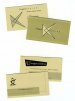
Definitely try this.What about playing with the idea of an infinity symbol creatively worked into your name?
What you have now seems very cookie cutter/kinda bland.
And I miss your rock and roll hair!
Love....Jill
Definitely try this.What about playing with the idea of an infinity symbol creatively worked into your name?
I do not have any opinions of your design that others haven't already stated, but I would like to comment on logo design in general and steps I think you should take (if you haven't already) that may give you a different outlook on your logo and what can be done with it.
Too often people start the design process on the computer and start adding the fancy effects straight away. The designer then gets stuck on that design, and starts to design "around" it, trying to make all additional elements fit that theme in an effort to justify all the work done adding the effects. It's sort of like buying all the furniture for your new apartment before you've seen the room sizes and then signing the lease because you need a place for your new stuff, not because the furniture fits well or it's a good place. I'm guilty of it myself from time to time.
Most good logos, however, start out with good old pencil and paper. Many black and white silhouettes are sketched until finally you pick two or three that stand out. Then you bring them into the computer and convert them to vector. After playing around and perfecting the vector silhouettes, choose the one you like best. Only then should you start adding the colors and effects.
What does this method accomplish? Well, first of all, it allows you to have a 1-color version of your logo that will be suitable for screen printing, pad printing, laser engraving, vinyl cutting, etc. You should always keep in mind the uses you want to put your logo to. Having only a full color design will limit those uses.
Secondly (and IMHO most importantly), if you're not satisfied with the silhouette of your logo, you will never be satisfied with the effects-laden version you will eventually build to.
So, what's my point in all this? Convert your logo to 1 color (if you don't already have it) and judge that instead of this. Are you happy with it? Does it work without all the bells and whistles? Is it "exciting", "fast", "solid", or any other emotional buzzword you were aiming for while designing it? If not, then you might want consider starting on some new designs.
 This is the best advice that anyone here can take!!
 Excellant response!