• I want to thank all the members that have upgraded your accounts. I truly appreciate your support of the site monetarily. Supporting the site keeps this site up and running as a lot of work daily goes on behind the scenes. Click to Support Signs101 ...

what do you hate about your software?

signmeup

New Member
So you are saying in Corel every font ignores what I posted? Not sure how that is possible but I have not used corel since v10

You say that if you punch in 2 inch tall letters, then it is the same height as a 2 inch square in every font?

It never works that way in Illustrator
Doesn't work for me in Illustrator CS4 but that's how Corel X4 works. (I didn't try every font but the odd assortment of scripts, Old English and serifed fonts I did try worked that way)

To clarify further... I never use points to size text. I make the first letter 2" or whatever (I have no idea how many points that is... and don't care) and go from there.
 

Flame

New Member
Nothing to throw in here yet other than....

In short, you can run into a problem if a client says, "I want Vivaldi Script set 2 inches tall with 1 1/2 inches of space between the lines,"


Where in ****ing **** do you run into a **** client that actually gives you stuff like this? 95% of the time I don't even let my clients pick their own font! Much less height or spacing!!!!

rofl. Dude I want to know who your customers are. Not a diss at all, that just blew me away as that's unheard of for me.

That's all :p


O wait, I'll go ahead and contribute. I'd like to say that Flexi...REALLY should fix their colors. No matter how you profile your monitor, colors never look close how they'll print. On the same monitor, I can bring up Corel and colors are actually pretty close to how they'll print. In flexi, it's nasty. Like 10% grey is almost invisible, greens are way too bright, etc. I could profile away and tweak until Flexi is closer, but then photoshop, CorelDraw, Illustrator and all my other programs would be off. It's the only one that's drastically different.
 

WildWestDesigns

Active Member
Much less height or spacing!!!!

Sometimes you have no choice in the matter. I've had to design vehicle magnets where text (charter numbers really) had to be such and such high and wide.

Sometimes you don't have a say in the matter, nor really does the customer for that fact in this instance.

However, I have dealt with customers that have had very definitive ideas on what they wanted and how they wanted it. Sometimes I like that better, it all depends though.
 

signmeup

New Member
nothing to throw in here yet other than....


Where in ****ing **** do you run into a **** client that actually gives you stuff like this? 95% of the time i don't even let my clients pick their own font! Much less height or spacing!!!!

Rofl. Dude i want to know who your customers are. Not a diss at all, that just blew me away as that's unheard of for me.

That's all :p
+1 :roflmao:
 

CES020

New Member
I must be missing something in the text discussion. Sure, in Corel, if you enter "2" in the "Object Size" window, a capital letter will be 2". Same thing in Illustrator. If you enter a font, click on it, then enter 2" in the Transform Panel, you're doing the exact same thing.

That's all well and good for all caps, but enter "Hop" and enter 2" in the "Object Size" in Corel and you'll get a capital H that's far less than 2". The entire object will be 2" from the top of the H to the bottom of the p.

I don't see how Corel is doing anything different than Illustrator on that front unless I'm not understanding correctly (which is likely).
 

Joe Diaz

New Member
Nothing to throw in here yet other than....


Where in ****ing **** do you run into a **** client that actually gives you stuff like this? 95% of the time I don't even let my clients pick their own font! Much less height or spacing!!!!
:goodpost: Same here.


To clarify further... I never use points to size text. I make the first letter 2" or whatever (I have no idea how many points that is... and don't care) and go from there.
I do it the same way in the cases where I have to make text a certain size (when using gemini letters for example), but since most the work we do is where we are given an area to work within, I size text to look right in that space minding the negative space and what not.
 

The Vector Doctor

Chief Bezier Manipulator
I have done many layouts or tracing for architects and they often specify exact letter heights, spacing, distance between objects, distances from edges, etc.
 

signmeup

New Member
I must be missing something in the text discussion. Sure, in Corel, if you enter "2" in the "Object Size" window, a capital letter will be 2". Same thing in Illustrator. If you enter a font, click on it, then enter 2" in the Transform Panel, you're doing the exact same thing.

That's all well and good for all caps, but enter "Hop" and enter 2" in the "Object Size" in Corel and you'll get a capital H that's far less than 2". The entire object will be 2" from the top of the H to the bottom of the p.

I don't see how Corel is doing anything different than Illustrator on that front unless I'm not understanding correctly (which is likely).
Don't type "Hop". Type "H". then make the H 2" tall. Now finish typing "op". It will fill in behind "H" in the correct size.

Illustrator won't make the "H" 2". It will make the invisible box around the H 2" and the letter smaller like Vec Doc is getting in his post.
 

Bobby H

Arial Sucks.
Signmeup, you still don't get it. Instead you, and others, are trying to turn this into some kind of flame fest.

You ignored the point and visual examples The Vector Doctor showed along with continuing to ignore what I said.

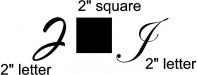
The only thing common from one font to the next is a 1000 unit tall em square. Everything else inside that em square can and does vary. The baseline can be set at a certain level. The "ascent" or capital height above the baseline can be set differently from one font to the next as well. Lowercase descenders and other letter features routinely dip below the baseline. Other letter parts rise above the ascent line. Sign design programs size the letter according to that distance between the baseline and ascent. You'll pretty close using Corel's transform dialog box sizing a squared capital letter in Helvetica. But you won't be close doing the same thing when it comes to a lot of other typefaces.

I don't see why that's so hard to understand. It's one of the key advantages sign making programs have over CorelDRAW and Adobe Illustrator. They can size lettering in any font according to that baseline/ascent size. CorelDRAW and Adobe Illustrator can't do it.

Where in ****ing **** do you run into a **** client that actually gives you stuff like this?

When you have a major client with a corporate identity program that includes a system of signs, yes you can run into these demands. They will have a design formula you must follow. For example the YMCA has a 30 page PDF of sign guidelines that cover everything from street signs to vinyl door graphics. You typically don't get to choose your own fonts when you're putting together work for a major company or government entity. I have run into the same thing with "well-heeled" small businesses. They'll go to an "environmental design" firm that comes up with the specifications. If I do a project that is traffic related I have to comply with the latest MUTCD rules and be sure whether the type is going to be set in Series 2000 Gothic or Clearview Highway.

If I put together a complex way-finding sign system where other designers will be adding other displays into the system I will develop the same kind of formula. It may seem anal retentive, but it is the only way to keep all of the signs in the system looking consistent. If the system isn't consistent then it looks like crap.

The Vector Doctor said:
I have done many layouts or tracing for architects and they often specify exact letter heights, spacing, distance between objects, distances from edges, etc.

Thanks for backing me up on this.
 

signmeup

New Member
No flame fest from me.

Turns out you're right BobbyH. I tried a bunch of fonts and although almost all of them behave exactly like I said, I did find one that behaves like you said. Here are the pics to prove it. The font is one of Steve C.'s excellent typefaces. It is way bigger at 144 points than any of the other fonts I tried. It was 64 thou. smaller than 2" when I clicked "2"" in Corel. So in this case I had to spend a couple of seconds tweaking the size to add the missing 64 thou. Not a big deal in my shop. You sound like you have a lot of highly educated and demanding customers that we just don't see here. For the stuff I do Corel works just fine with font sizing.

Illustrator doesn't work this way for me though.
 

Attachments

  • Fontsquares.jpg
    Fontsquares.jpg
    57.7 KB · Views: 90
Last edited:

CES020

New Member
Don't type "Hop". Type "H". then make the H 2" tall. Now finish typing "op". It will fill in behind "H" in the correct size.

Illustrator won't make the "H" 2". It will make the invisible box around the H 2" and the letter smaller like Vec Doc is getting in his post.

It's making the box around it to fit any possible combination of letters with ascenders and descenders that equal 2". The little "box" around it is taking into account for those in that font. It's making the entire font set 2" tall, not that one letter. I understand you now.
 

Jillbeans

New Member
I'm just starting with Corel X5 and so far I really hate it.
It takes forever to load (that may be my fault)
And I can't find any way of changing the options for the envelope tool.
I'll have to get out the manual I guess.
Corel 12 seemed much easier to figure out.
Love....Jill
 

WildWestDesigns

Active Member
I'm just starting with Corel X5 and so far I really hate it.
It takes forever to load (that may be my fault)

I would look into your computer specs first. I know when I was using my old computer and I was running Wings Modular, it would take forever to make changes to patterns if they were bigger then 100mm x 100mm. Nothing kills the creative process than that. Especially when you have a train of thought going.
 

signmeup

New Member
Just tried the "size letters" thing in Flexi out of curiosity. Here is what I got. WTF? I typed in the letter and clicked 2" in the letter size drop down. The letters are no where near 2". It works with Helvetica though.
 

Attachments

  • FlexiLetters.jpg
    FlexiLetters.jpg
    22.6 KB · Views: 78

Bobby H

Arial Sucks.
CES020 said:
It's making the box around it to fit any possible combination of letters with ascenders and descenders that equal 2". The little "box" around it is taking into account for those in that font. It's making the entire font set 2" tall, not that one letter. I understand you now.

In Illustrator, you're stuck converting the type to outlines and then resizing the type according to a squared off reference letter, like a capital H in Helvetica or Arial.

However, I did some searching and found a couple links to scripts that will allow you to select type and then resize according to inches using the baseline and ascent as the reference. The one I tried isn't 100% perfect, but it does get the lettering within .001" of the proper size. For specific line spacing you'll have to specifically place guidelines or reference objects and snap the type baselines to them.
http://wdsiemer.blogspot.com/2011/04/illustrator-letter-height-script.html

signmeup said:
Just tried the "size letters" thing in Flexi out of curiosity. Here is what I got. WTF? I typed in the letter and clicked 2" in the letter size drop down. The letters are no where near 2".

That's what I've been trying to say all along. The size from the baseline to ascent is the true letter size, not the overall size of the characters. Corel and Illustrator don't provide an easy way to set type based on that.
 

Custom_Grafx

New Member
The irony is, I remember learning an engraving software in the early 90s that had more advanced text sizing features than corel and illy.
 

signmeup

New Member
Originally Posted by signmeup
Just tried the "size letters" thing in Flexi out of curiosity. Here is what I got. WTF? I typed in the letter and clicked 2" in the letter size drop down. The letters are no where near 2".


That's what I've been trying to say all along. The size from the baseline to ascent is the true letter size, not the overall size of the characters. Corel and Illustrator don't provide an easy way to set type based on that.
Hold the phone... you said in post #154 that Flexi (a dedicated sign making application) had this down.

Here is the word jelly in A&S Snapper, sized to 2" in Flexi. Nothing is 2". Not the cap, the descenders, or the lower case letters. What gives?
 

Attachments

  • JellySm.jpg
    JellySm.jpg
    21.4 KB · Views: 99
Top