-
I want to thank all the members that have upgraded your accounts. I truly appreciate your support of the site monetarily. Supporting the site keeps this site up and running as a lot of work daily goes on behind the scenes. Click to Support Signs101 ...
You are using an out of date browser. It may not display this or other websites correctly.
You should upgrade or use an alternative browser.
You should upgrade or use an alternative browser.
Extreme Makeover Design Contest
- Thread starter Fred Weiss
- Start date
Ken
New Member
SO when a candidate is chosen, and we all go to work on a makeover, will a sign actually be made and presented to the establishment? Who will pay for it, install it? I think it could turn out as great PR for signers/designers if promoted well.
Fred, is this in the plans?
If we all chipped in , like 20 bucks, we could ..with some press/TV publicity, have a great event here. We could finance the winner to create and deliver/install a new sign for the hapless business that gets selected.
And follow up to see if it makes a difference.
Of course, if it is simply to create a good design , I will still participate..but I'm finally getting busy again...
What would be cool, is if we can find a major corporation that needs a makeover, put our heads together and present the idea thru the media.
IE:
"KXLY TV in Spokane has breaking news that the Microsoft logo design has been attacked by members of the Signs101 Community."
WE go to our Seattle correspondent, Wynn Doews, for a report.
"We always thought it was a little weak" said Fred Weiss, founder of the Signs101 website. "We challenged our members to create something much better than the existing logo. Something that expresses the real mission of the company" Blah, blah, blah...
Great fun...Ken
Fred Weiss
Merchant Member

Jillbeans
New Member
I think if we gave someone a free design or sign it would totally devalue us.
Last winter I posted pix of my local icky signs on L'ville.
I was slow, so I re-worked them and actually got around to showing my ideas to some of the owners. In some cases I was met with outright hostility.
Some people are proud of their kid's artwork!
I am going to submit two or more pictures, at least one being a mediocre sign.
I just have to find time to snap them, and maybe borrow my daughter's car so they don't see me in my shop truck!
Love....Jill
you didn't find the one Arlo was ashamed of in aprevious post where he stated he used your fonts?
LOL, Didn't see that thread Cadmn. Hope he wasn't blaming my fonts...

All those signs are within two miles of my shop, closer to my place than Arlo's.

Geary
New Member
In some cases I was met with outright hostility.
Some people are proud of their kid's artwork!
Oh Lordy is that ever true Jill !! My very first experience with LOSING a sign bid was when I "fixed" a guy's design that he had spent a very long time on in his own drawing room. I was 25 and the sting of that moment still is in my head thirty years later.
:Oops:
That's why I always try not to mess with anyone's design as a completely different look unless I'm specifically asked to or I can somehow schmooze my best salesmanship on them to do so. Otherwise, I just release the work to someone else out in the world.
~Gear
Replicator
New Member
The Customer Is Always Right . . . LOL


Replicator
New Member

Fred Weiss
Merchant Member
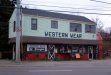
The Western Wear shop looks to be busy..all those people in the window.
Ken
Wonder if they take credit cards? :Big Laugh
Air Art Girl
New Member
Geary
New Member
AAGirl,
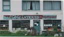
I've preached for YEARS to NEVER adjust copy 'til it's close to the edge of the layout...."it just won't breathe". This sign should be one that broke all the sacred rules choking itself to death. Yeah, this one is definitely going STRAIGHT to hell when it dies! LOL And look how well those colors work. Holy crap~!
~Gear
Air Art Girl
New Member
I hear ya Gear, as you know, North Bend has been choked to one word!! lol
Marlene
New Member
I like the idea of the van Gino as it isn't horrid, but there's something really wrong about it. The Bad Girls is also good as it looks like some one tried to make it look good but just didn't have any clue how to. I wouldn't submit the winner's design to the owner of any of these beauties as we all know from working with customers that some of the worst looking crap is something that they are really proud of. Take a look at these two "logos" that I was forced to make signs from. They are about the worst looking things that I've seen in a long time. The thing is that both of these customers love their logos and would be really mad if some one came up with a re-design of either of them. We could do it here and no one's feeling would be hurt.
Attachments
Last edited: