• I want to thank all the members that have upgraded your accounts. I truly appreciate your support of the site monetarily. Supporting the site keeps this site up and running as a lot of work daily goes on behind the scenes. Click to Support Signs101 ...

Extreme Makeover Submissions - Vote Now

Extreme Makeover Design Contest - Vote Now

  • Post 2 - GraphiXtreme

    Votes: 5 6.3%
  • Post 3 - iSign

    Votes: 1 1.3%
  • Post 4 - Replicator

    Votes: 13 16.5%
  • Post 5 - Gino #1

    Votes: 2 2.5%
  • Post 5 - Gino #2

    Votes: 2 2.5%
  • Post 6 - mladams7259

    Votes: 7 8.9%
  • Post 7 - Marlene

    Votes: 2 2.5%
  • Post 8 - Marlene

    Votes: 15 19.0%
  • Post 9 - Steve C. #1

    Votes: 0 0.0%
  • Post 9 - Steve C. #2

    Votes: 0 0.0%
  • Post 9 - Steve C. #3

    Votes: 1 1.3%
  • Post 9 - Steve C. #4

    Votes: 1 1.3%
  • Post 10 - Gino

    Votes: 0 0.0%
  • Post 11 - Jillbeans #1

    Votes: 2 2.5%
  • Post 11 - Jillbeans #2

    Votes: 0 0.0%
  • Post 11 - Jillbeans #3

    Votes: 2 2.5%
  • Post 11 - Jillbeans #4

    Votes: 16 20.3%
  • Post 11 - Jillbeans #5

    Votes: 1 1.3%
  • Post 12 - Air Art Girl

    Votes: 0 0.0%
  • Post 13 - Marlene

    Votes: 1 1.3%
  • Post 14 - Sign-Man Signs

    Votes: 4 5.1%
  • Post 15 - slapakiss

    Votes: 4 5.1%

  • Total voters
    79
  • Poll closed .

Fred Weiss

Merchant Member
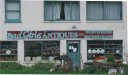
Hello students. Here are your candidates for the Extreme makeover.

You may have until midnight EDT, Saturday April 21, 2007 to vote.

The second part will be the actual makeover. Dates, prizes and rules to be announced.
 
Last edited:

ChiknNutz

New Member
When I saw this thread, I knew I had a really good candidate for this. I've been eyeing this thing for a while now...I took this picture just over 2 years ago...just waiting to get a chance to redo it.
 

Attachments

  • Asbery Field.jpg
    Asbery Field.jpg
    118.9 KB · Views: 256

iSign

New Member
ok... here is a submission of a clients sign.
I just did a banner for these folks & they were very pleased with the service, & now they want a quote on refurbishing this sign. I think dismantling & repainting each letter & re-installing it is going to be pretty expensive, so I will probably offer them a flat sign with all new material, as well as a refurbish of this one. I will also offer to put the refurbished letters back up differently... but anyway, they need a makover, so I figured I'd throw their hat in the ring.

seafoodsign.jpg
 

Replicator

New Member
Pride and joy of the Valley . . . Old non-working light box.

Both sides same . . . Screwed on cardboard drawn with Sharpies !

It's a real eye catcher around here !

I know I've shown this on another thread, but it's my pick for

Extreme Sign MakeOver ! ! !

? ? ? Do you know the name of the establishment ? ? ?
 

Attachments

  • pride.jpg
    pride.jpg
    359 KB · Views: 341

Gino

Premium Subscriber
??????

Well, no one mentioned what the subject matter had to be.

This guy advertises doing whole trucks for $100.00....

I wonder how he can do that ????


Only in :unclesam:
 

Attachments

  • A-1 signs.jpg
    A-1 signs.jpg
    323.5 KB · Views: 308
  • A-1 truck.jpg
    A-1 truck.jpg
    346.8 KB · Views: 312

Marlene

New Member
Here's two of the signs I'd love to re-do. The American Legion I'm sure was done by a member with sign painting "talent". I just love the use of space on the arc. The next one is a diner. The picture is makes it look like there's more contrast between the blue and burgundy then there really is. The two colors blend together in real life. They did huge letters on diner to, I guess, make it stand out, then put it on a background with the same color value so that it doesn't show up at all, clever. The whole layout of of the sign, color choices the palcement of the oval and KJ's, it's all so pretty.
 

Attachments

  • DINER.jpg
    DINER.jpg
    72 KB · Views: 327

Steve C.

New Member
I guess it's ok to submit more than one?
 

Attachments

  • 3Bs auto sales.jpg
    3Bs auto sales.jpg
    436.9 KB · Views: 179
  • alpha omege.jpg
    alpha omege.jpg
    307.1 KB · Views: 232
  • beto hernandezjpg.jpg
    beto hernandezjpg.jpg
    378 KB · Views: 169
  • tex mex motors.jpg
    tex mex motors.jpg
    474.7 KB · Views: 202

Gino

Premium Subscriber
Must it be a sign ??

This could use some attention...... or less..........

Nothing really wrong, just needs some 'Oomph!!'
 

Attachments

  • plumber-heavy copy.jpg
    plumber-heavy copy.jpg
    373.6 KB · Views: 279

Jillbeans

New Member
OK, here are some local "gems" and even one that everyone gushes over but I think is mediocre.
Love....Jill
 

Attachments

  • 2bit.JPG
    2bit.JPG
    67.4 KB · Views: 259
  • church.JPG
    church.JPG
    63.4 KB · Views: 264
  • int.JPG
    int.JPG
    65.9 KB · Views: 250
  • jims.JPG
    jims.JPG
    82.3 KB · Views: 278
  • western.JPG
    western.JPG
    72.6 KB · Views: 249

Marlene

New Member
I like the idea of the van Gino as it isn't horrid, but there's something really wrong about it. The Bad Girls is also good as it looks like some one tried to make it look good but just didn't have any clue how to. I wouldn't submit the winner's design to the owner of any of these beauties as we all know from working with customers that some of the worst looking crap is something that they are really proud of. Take a look at these two "logos" that I was forced to make signs from. They are about the worst looking things that I've seen in a long time. The thing is that both of these customers love their logos and would be really mad if some one came up with a re-design of either of them. We could do it here and no one's feeling would be hurt.
 

Attachments

  • ROTUNDAS.jpg
    ROTUNDAS.jpg
    69.2 KB · Views: 241
S

Sign-Man Signs

Guest
Good news, Bad News

Good News, we did sign on either side of the one in the middle. Bad news, well just take a look at what a store owner put between them. Great work huh?
 
Last edited by a moderator:

njsigns

New Member
While I agree that all of the signs are horrific, most of them are that way because the customer was a cheap SOB. I personally voted for Marlene's post number 8. These people deserve a new sign that represents the legion and it's members with some dignity.

I'm not sure how legions work or if they have a budget for improvements, but I feel those who serve our country knowing they could possibly pay the "ultimate price" deserve something to better represent them (or at least that doesn't look like a drunk made it while on a bender)... JMHO

will this just be an exercise in design, or will the creation of the sign come to fruition?

Gene
 

Craig Sjoquist

New Member
must admit they are all bad ... but my vote was based on what type of business vs readablity all you could read when close enough like across st so went for the one that should have looked alot better for what the public sees and views
got so many of bad looking signs in this town I'd fill up the website lol
thank you n enjoy life
 

iSign

New Member
I was going to vote for mine... 'cause using this site to get out of doing my own work always seems to generate some interesting discussions :wink:

...but instead, I voted for Jillbeans first one. It seems as though someone really wanted a nicer design then the usual & therefore it lends itself to suggestions with a greater deal of embellishment.

I still don't think there was ever any intention of showing the makeover results to any owners of the original sign... but fixing up some of those layouts would feel like casting pearls before swine.

I liked njsigns reasoning for his vote though, & would change my vote if I could, based on his post. I also think that they may be receptive to an offer of a free design upgrade, where a commercial operation may be offended.
 

Ken

New Member
Well just looking through the submissions I also thought the Legion sign should be the "winner". Then I read the last two posts and that clinches it for me. I suggest that if it is the Legion sign for a re-make we all pony up a couple of bucks and present them with the real thing. (After asking them, of course.)
Ken
 
Top