-
I want to thank all the members that have upgraded your accounts. I truly appreciate your support of the site monetarily. Supporting the site keeps this site up and running as a lot of work daily goes on behind the scenes. Click to Support Signs101 ...
You are using an out of date browser. It may not display this or other websites correctly.
You should upgrade or use an alternative browser.
You should upgrade or use an alternative browser.
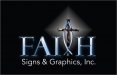
Logo and Name combined whatcha think
- Thread starter tintwizz
- Start date
J Hill Designs
New Member
if thats what floats your boat...
wildside
New Member
We are a Christian based company and This is what I came up with. I am in the process of having it trademarked.
any kind of religion aside.... you will drive away many with the name and look, granted you will attract some too
Joe Diaz
New Member
First, I would suggest posting a jpg instead of a pdf, I have found that you get more participation that way.
Second. I think you should reverse the colors on the cross and the fish. You want the cross to double as a "t" I take it. SO, having the "t" be the same value as the rest of the lettering will make "faith" easier to read.
Also, the main copy and the second copy don't jive in my opinion. Mainly because one has all these bitmap effects added to them and the second one is plain vector. I would suggest doing one logo that is just vector without the effects and one that is consistent with the effects. The one without the effects will probably be a better easier to implement logo. Al ot of times, effects just kind of get in the way.
HulkSmash
New Member
ok so i can see where this thread is about to head.
but the logo. the sub text under faith doesnt hold up to the standard of the rest of the logo.
Also i understand your religious and god fearing, as many are here.. but you sure that's a name you want for your company. It may scare some customers away.
but the logo. the sub text under faith doesnt hold up to the standard of the rest of the logo.
Also i understand your religious and god fearing, as many are here.. but you sure that's a name you want for your company. It may scare some customers away.
signmeup
New Member
"Signs and graphics" is sharp and crisp. "Faith" is all fuzzy. Looks really odd to me that way. Maybe if you fuzz up the whole thing it'll look more cohesive. What does it look like with no effects?
On the name... I try to avoid religious people. (I don't really mind religious people... as long as they keep it to themselves) Plastering it on the front of your business is not keeping to yourself. Just sayin'.
On the name... I try to avoid religious people. (I don't really mind religious people... as long as they keep it to themselves) Plastering it on the front of your business is not keeping to yourself. Just sayin'.
J Hill Designs
New Member
..in the thumbnail view it kinda reads "FAISH"
WhiskeyDreamer
Professional Snow Ninja
You've obviously put time into the idea and design, but this doesn't say "signs" to me. It says "church" and that's not the message you need to get across.
Like others have said, I think the amount of effects you have draw attention away from the design. When you created this, did you start in b/w? If yes, can you post that?
I agree with wsgraphix. Because your design and name emphasize religion, you may drive quite a few customers away.
Like others have said, I think the amount of effects you have draw attention away from the design. When you created this, did you start in b/w? If yes, can you post that?
I agree with wsgraphix. Because your design and name emphasize religion, you may drive quite a few customers away.
Christian @ Visual Graphx
Active Member
I started my company to Help local churches, but what I found is you really need to create a separate Identity to market directly to churches and still appeal to the mass market. You will short change yourself having that as your main name, as a lot of medium to large corporations are going to pass by fearing issues with religion.
Just my .02, We tried the route you are going and ended up renaming the company and having 2 marketing approaches. Just remember Tradenames are cheap so you can always DBA if the market segment is specialized.
Just my .02, We tried the route you are going and ended up renaming the company and having 2 marketing approaches. Just remember Tradenames are cheap so you can always DBA if the market segment is specialized.
Joe Diaz
New Member
I don't know if you thought of this yet, and this may not be your intention, but people outside your faith group (and possible some within it) may see you as being exclusive, and not open to doing business with folks outside your faith. You can still help out your fellow Christians, with out appearing as though Christians are the only ones you will do work for. Unless that is the goal and if so I believe you should reconsider.
This is no slam against religion, but in our 30 plus years of being in business, we have found that churches tend to want things donated. (which I can understand) Knowing that, I would think setting yourself up to target only one specific group would be detrimental to your business, especially a group that expects deals, discounts and donations.
Look at it this way: The more people you target, the more jobs available. In addition to more work being available to you, if you do honest good work, which I'm sure you do, the more successful your business will be. The more successful you are, the more you can help your local churches... or more importantly your fellow man.
TheSnowman
New Member
That's not gonna be fun to cut in vinyl if you ever have to, that's all I know.
HulkSmash
New Member
but in our 30 plus years of being in business, . (which I can
Thought you were like 29
Gino
Premium Subscriber
It looks Okay to me. I would only change the star glow behind the 'T' to a glow lighting up the entire height and width of the 'T' so it looks like a cross and not a starburst.
As for changing your name or the looks of your aim for business, only you can determine what you want your image to engulf. There are all kinds of reasons to do so any things and anyone here can play devil's advocate.... so after the dust settles, it's still up to you on how you approach the world with your business and business model.
I do think there is some conflict between your name and the secondary copy, but this doesn't appear to be a finished product, but rather something in progress, so carry on. let's see where you go from here...............
Joe Diaz
New Member
Thought you were like 29
Younger, but it's a family business that started in the late 70s and believe it or not we have records that go back that far. :Big Laugh
Billct2
Active Member
Looks like FAIH
The "logo" and tag line don't jive
I'd like to see a plain version and then an effects version.
As for the marketing part of the design I like CT2's suggestion of two entities, but if
you must go with this image my other issue is it reads we are "Heavy Metal" religious designs to me, which narrows your audience even further.
SignManiac
New Member
I see you're from Z-Hills, same here. Guess that makes us competitors but that's ok. Everyone here is giving you good advice. You probably could make a good living off of the churches around here. Although I am the anti-faith, churches can spend some good money, I've done some high dollar signs for a few of them. Must be three hundred around here at least.
Are you by any chance www.48hrbanner.com ? I just saw your site recently. One of the other shops thought you were Frankie Ammons but I guess not. I've been here about twenty years and have seen many shops come and go over the years. Only advice I can offer is get your design down, otherwise you're just competing with Tina and a few of the others in town, and that's not who you really want to compete with.
If you really want to make it then step up your game as much as you can and set yourself apart from everyone else. It's also the only way you can get your prices up. Good luck to you.
Last edited:
HulkSmash
New Member
Younger, but it's a family business that started in the late 70s and believe it or not we have records that go back that far. :Big Laugh
ah me and you are close in age
")
speedmedia
New Member
hmmm. I agree with Joe, you are sort of putting yourself into a corner. It also might be a turn off to people who aren't "of your same religion" If that is the clientele you are going after then you will probably be ok.
No knock on religion but when someone starts off by saying "We are a good christian based company" Sometimes, they don't practice what they preach. Now I know they aren't all that way and I don't look at them in that way but you know there are those bad apples that use it for the wrong way and they make everyone look bad. Again, not looking for debate.
As for the logo I like it, I think it looks kind of cool, but agree it looks more like a church than it does a sign shop.
Thanks,
Kurt